← PortfolioTreder Design · 2019

Designing for Yourself Is Tough

A decade of designing products, and never once a brand identity. So I made myself my own most demanding client.

Brand designer — and my own client

Designing for Yourself Is Tough
~100
Signs sketched in exploration
3
Core values defined
Neue Plak
Typeface, by Paul Renner
Gold + Black
The primary palette

Context

I spent my entire career working on products and user interfaces. I built multiple teams, completed hundreds of projects and launched dozens of products. I had never designed a full brand identity.

I always had great respect for designers working on brands — some of my heroes, Massimo Vignelli and Michael Bierut, designed timeless identities. Finally I decided to surrender to the desire and allow myself a dream project: my own brand.
Finding the story

Before sketching anything, I started writing. What do I stand for? What is important to me in design? How can I contribute to teams creating amazing products?

I started at the level of values. I consider myself a principled man with solid self-awareness, and yet I struggled to name them. After a deep dive into my past and my ambitions, I landed on three: loyalty, mastery — the never-ending strive to become better — and self-discipline.

Then I thought about the critical moments in my career. My career was not built entirely on craft. I was quickly promoted to leadership, and as a leader I made more impact than as a designer. I could talk to people when others were silent, form teams from individuals, and create the healthy tension that led everyone to great results. I am a designer, but I exist for the people.

Exploration

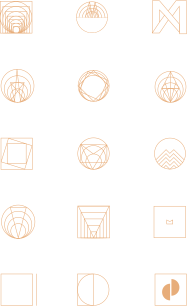
I sketched geometrical signs that represented my story on some level — nearly a hundred of them, some esoteric, some very straightforward. I took a lot of inspiration from the modernist era, striving for the same simplicity, compelling message and clean aesthetics.

I decided gold and black would be the primary colors. Cold metal — high value, stability — combined with the space created by the absence of light felt exactly right.

Examples of signs created during the exploration phase.

The sign

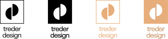
The final sign is a sharp gold rectangle encompassing two halves of a circle: individuals working together thanks to creative tension. Simplicity of values, and leadership creating space for collaboration.

Then typography. Intuitively I started with my typographic hero, Adrian Frutiger — Avenir, Avenir Next, Frutiger, Univers. Nothing looked right. Casting a wider net, I found it: Neue Plak, a modern reedition of Plak designed by Paul Renner. Modern but classically modernist, not anonymous, not overused, and simply beautiful.

Results

The brand identity inspired this entire portfolio website — the one you are reading now.

And defining my values helped me better understand myself and my career path.

Lessons learned

  • Designing a brand identity is much more a task in storytelling than in sketching.
  • It may take a hundred takes to find the right sign for the story. It is worth it.
  • I loved the process.
Next project

Adele — The Design Systems Repository

Open Source · 2018 · Creator, designer and engineer

← All work